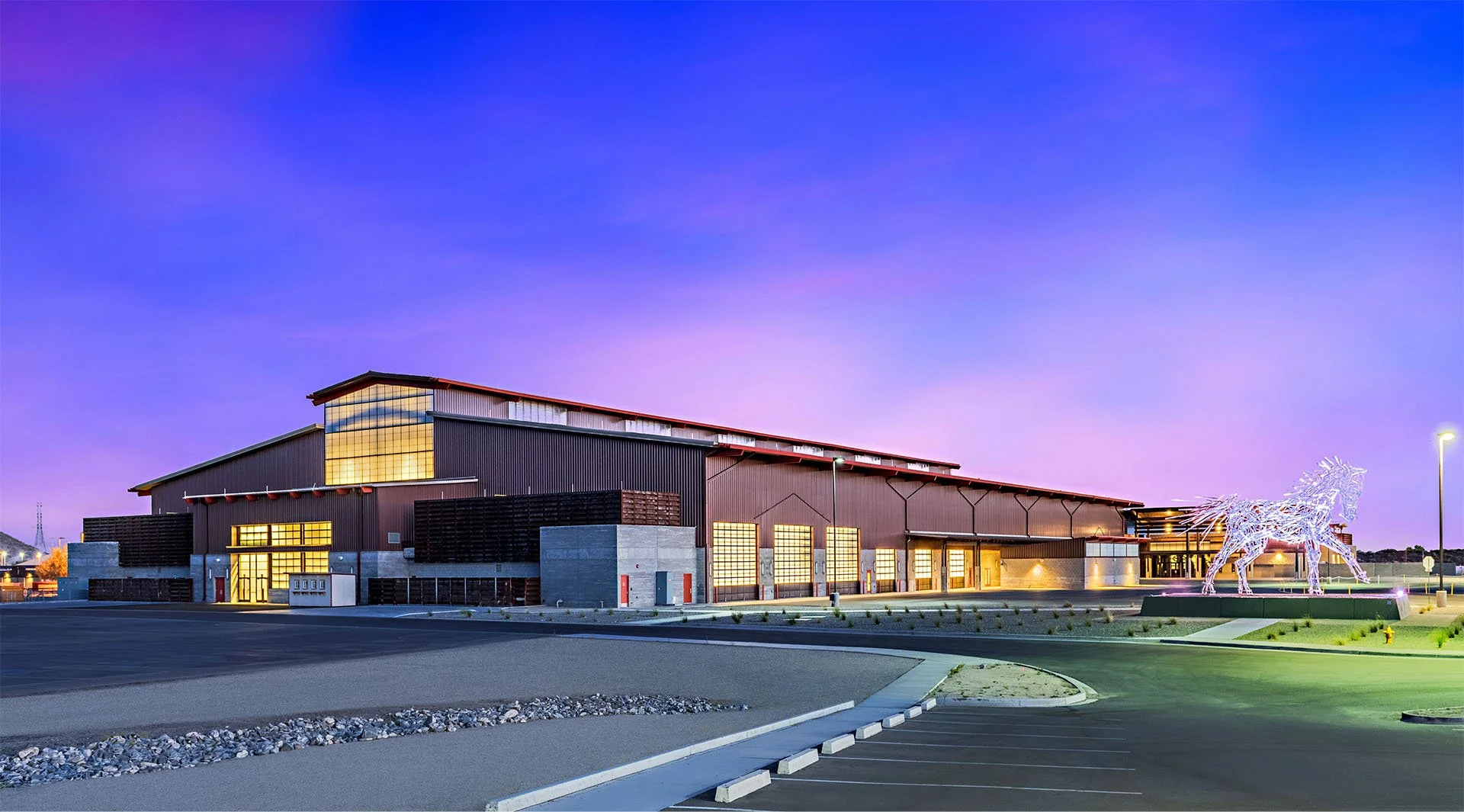
Redefining a Scottsdale Icon
project overview
WestWorld of Scottsdale is a premier event destination known for its Western heritage, equestrian events and year-round lineup of experiences. As the venue continued to evolve, the opportunity was to create a brand identity that reflected everything WestWorld had become, not just what audiences already knew it for.
The goal was to modernize the brand while preserving the authenticity, character, and Western roots that made WestWorld unique.
The result was a refreshed identity and digital experience designed to position WestWorld as a destination for everyone.
client
WestWorld of Scottsdale
role
Lead Designer
As Lead Designer, I helped bring the WestWorld brand refresh to life through:
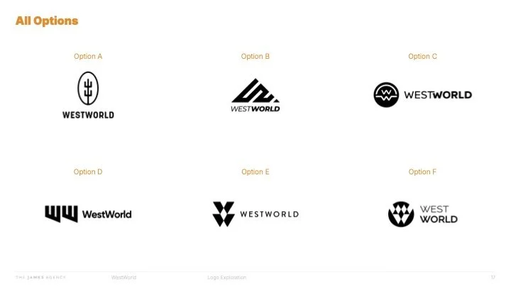
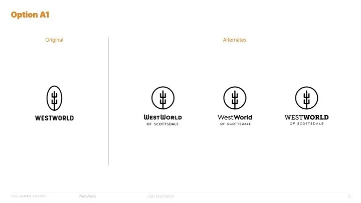
Logo design
Brand identity development
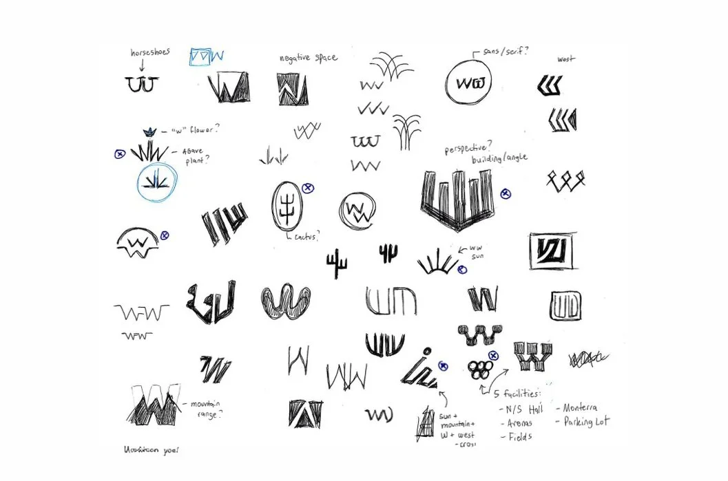
Visual system exploration
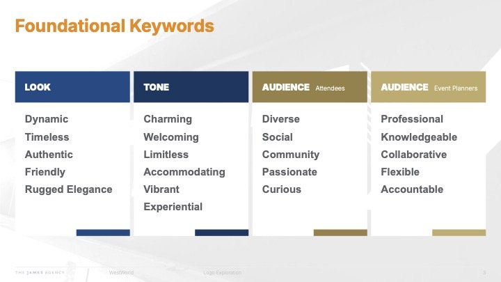
Typography and color direction
Website design
Digital brand applications
Brand standards
WestWorld had a strong legacy, but its perception did not fully reflect the breadth of experiences it offered.
While many audiences associated the venue primarily with equestrian events, WestWorld had grown into a versatile destination hosting a wide range of events and experiences.
The challenge was shifting the perception from "An equestrian facility" to "A destination where the community comes together."
The new identity needed to honor the brand’s Western heritage while creating room for future growth.
the challenge
the idea
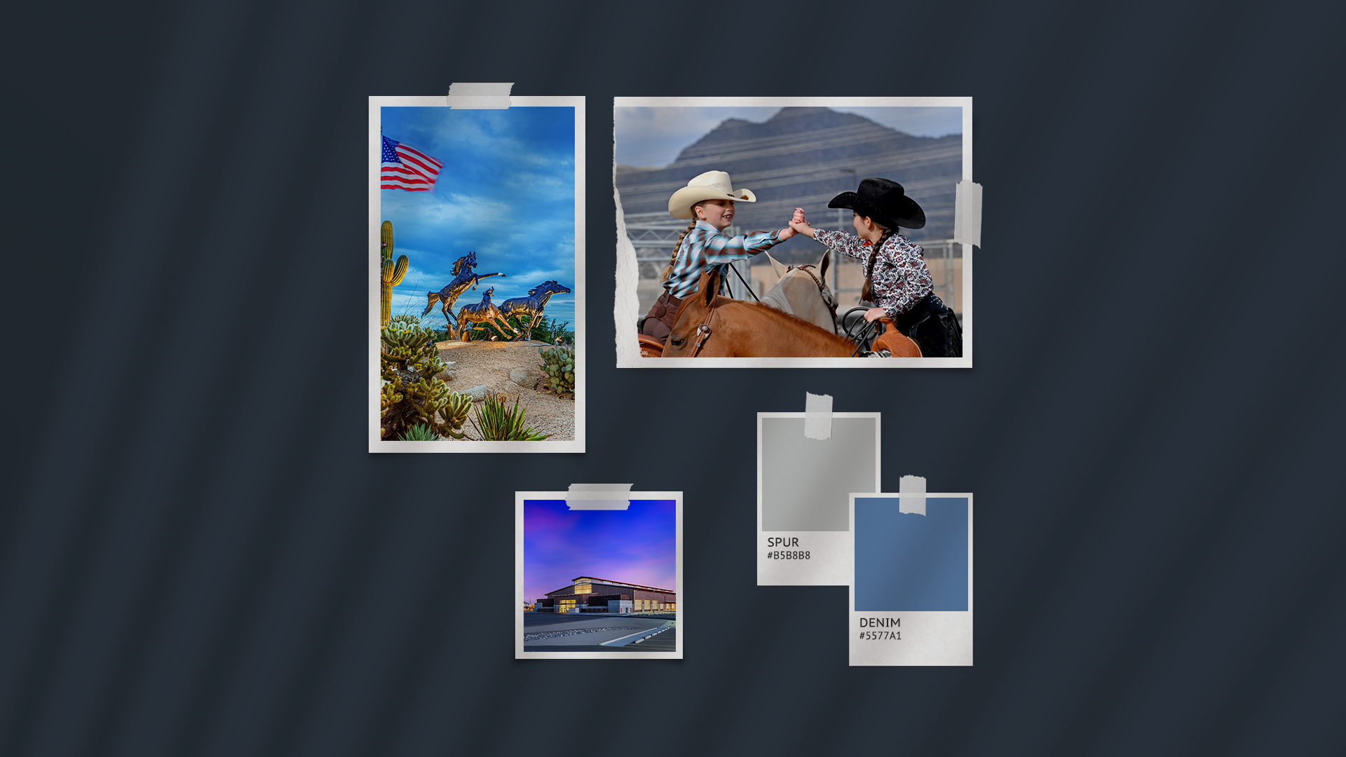
The West is more than a place. It is a spirit.
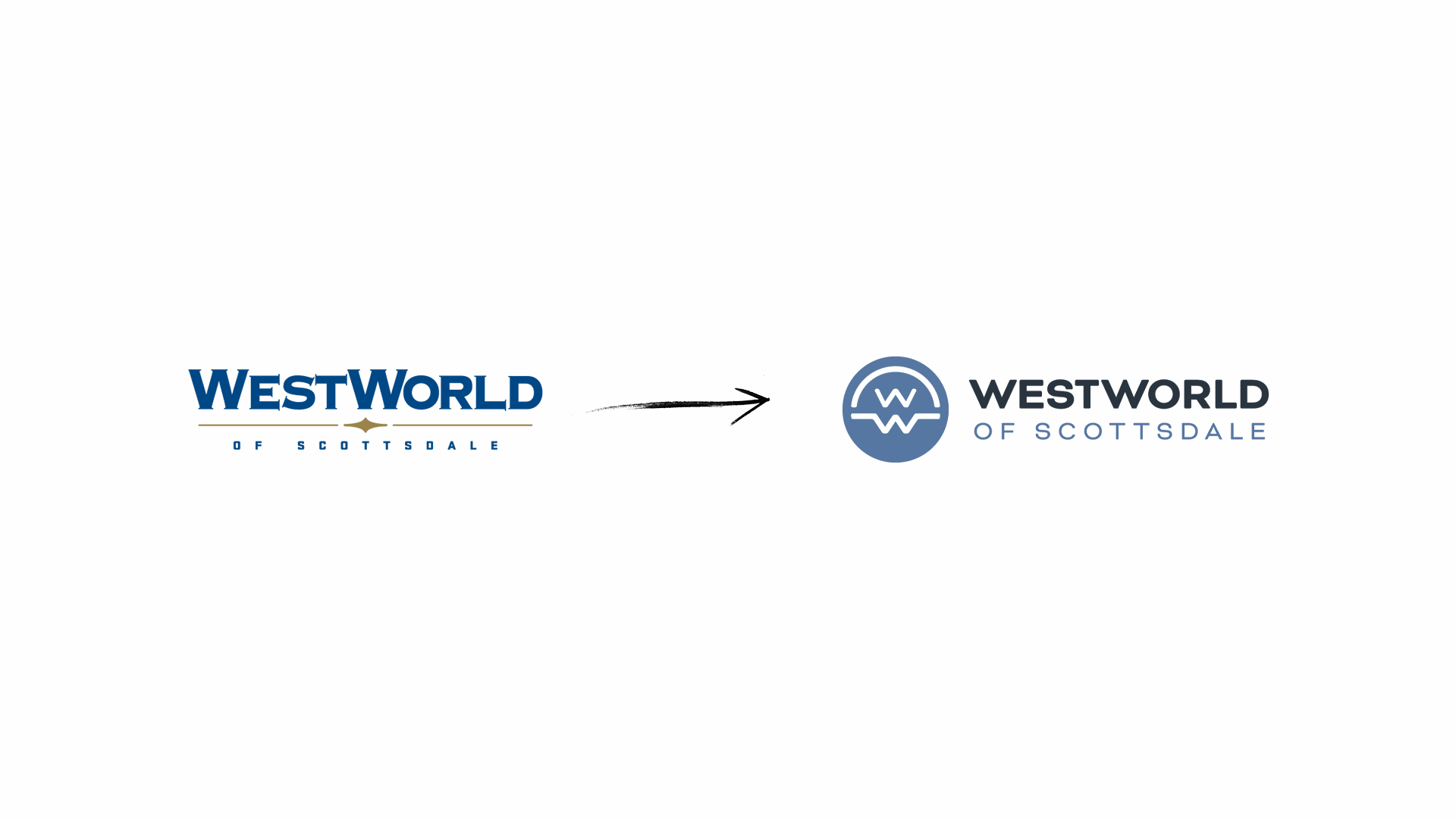
The refreshed identity was built around the idea of bringing people together through shared experiences, combining the grit and authenticity of the West with a more modern, polished expression.
The goal was not to erase WestWorld’s history but to evolve it.
the visual direction
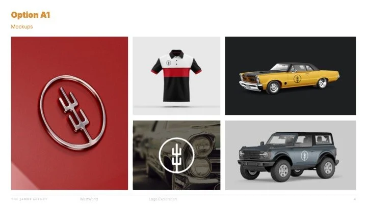
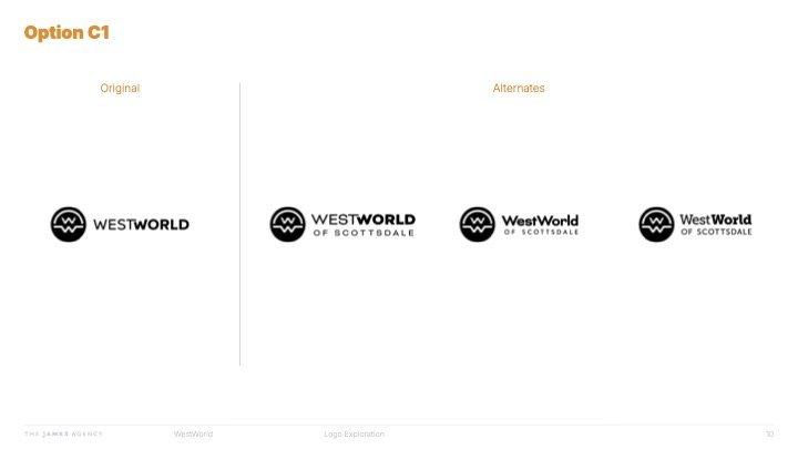
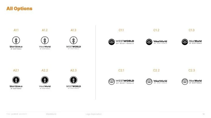
The new identity balanced Western character with contemporary design.
The logo system and visual language were designed to feel confident, recognizable and versatile across everything from large-scale events to digital experiences.
Typography, color, and graphic elements worked together to create a brand that felt rooted in tradition while positioned for the future.
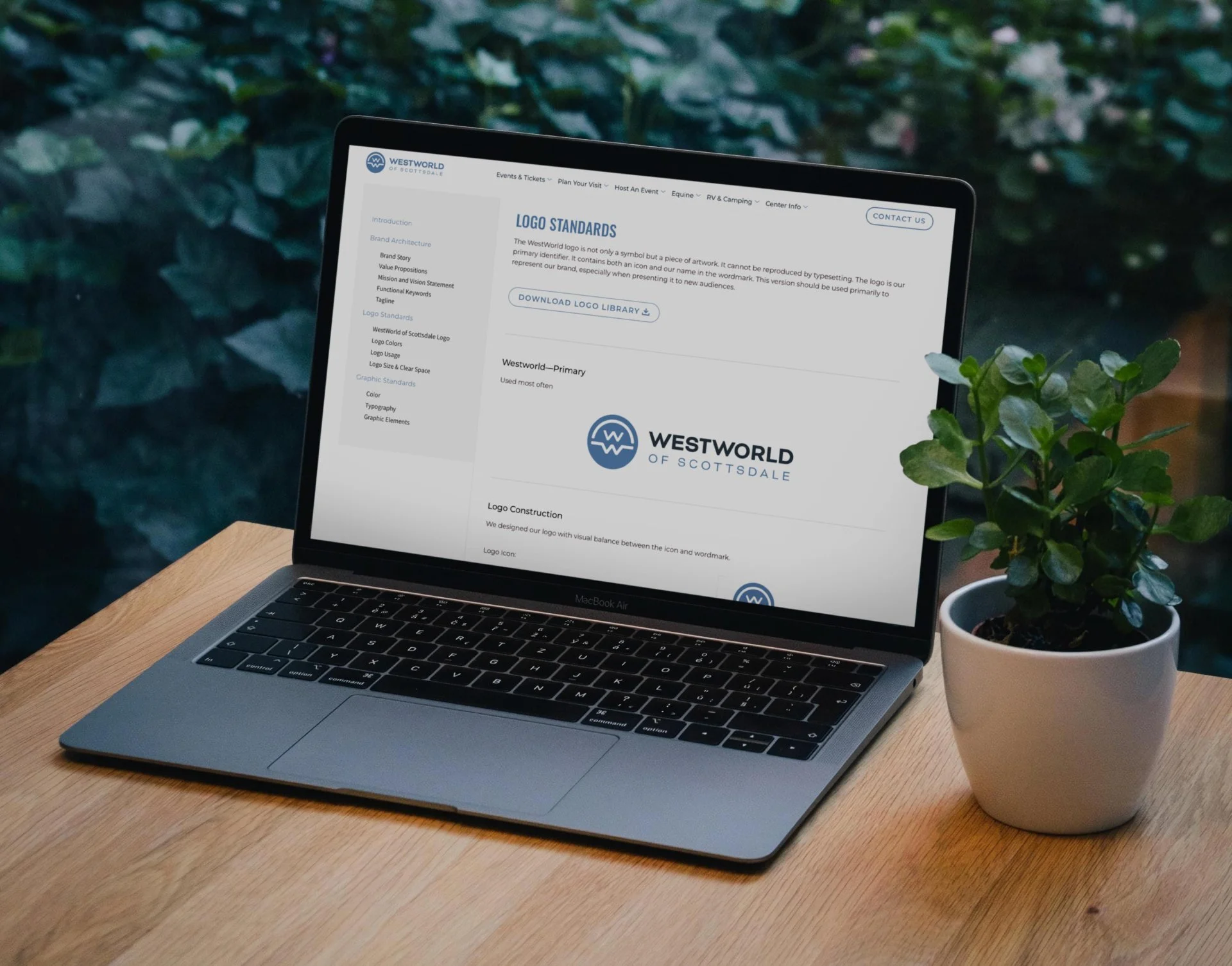
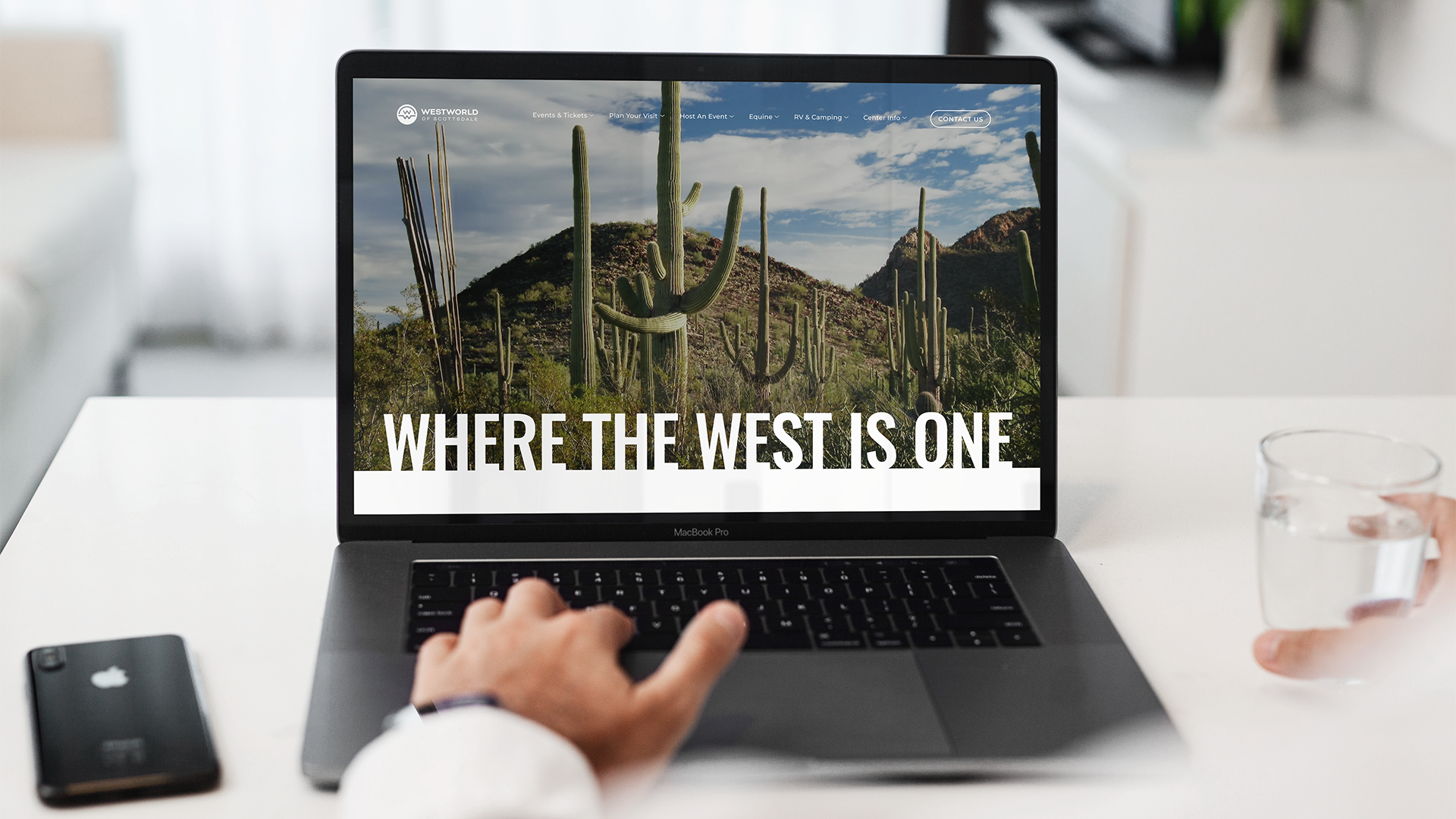
The website design extended this refreshed experience by creating a more intuitive, modern digital presence that better showcased WestWorld’s diverse event offerings.


the results
The refreshed brand helped reposition WestWorld as a more dynamic and accessible destination while creating a stronger foundation for future marketing efforts.
Results included:
A modernized brand identity
A stronger connection between heritage and future growth
A more cohesive visual system
An elevated digital experience for visitors and event planners
Increased awareness of WestWorld’s broader capabilities
15K+ new visitors in 30 days after the website launch
how we got there